Single Family


PROJECT OUTLINE
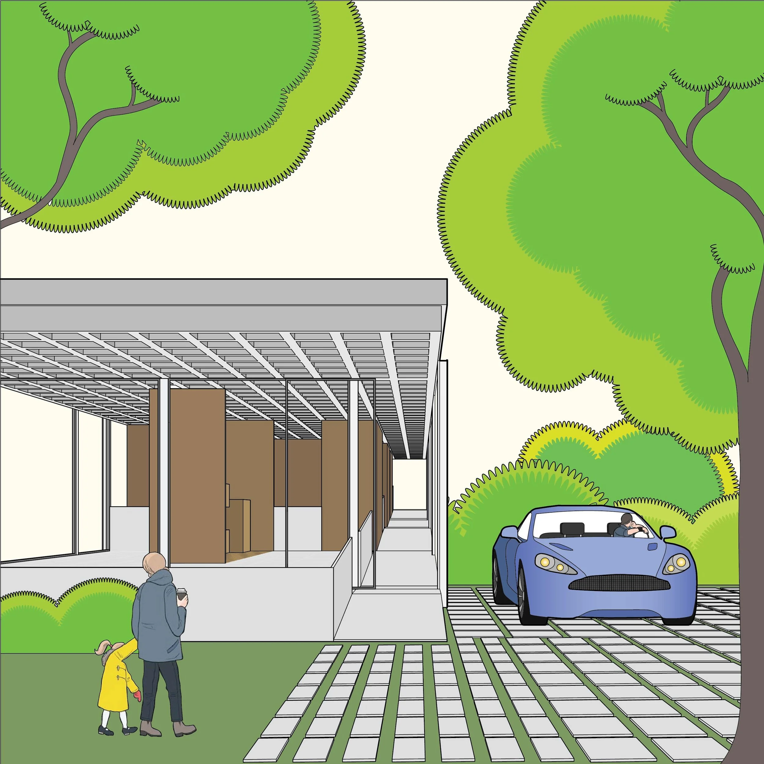
This single family house bring accessibility and high-end design together. Designed to not only fulfill the ADA guidelines, but to welcome residents that have mobility issues, visual impairments and deafness to the fullest extend. The project started by taking the principles of the Farnsworth House and applying them to design a more inclusive and accessible space. The Mid-Century Modern values and aesthetics are kept while challenging traditional dimension standards and circulation.
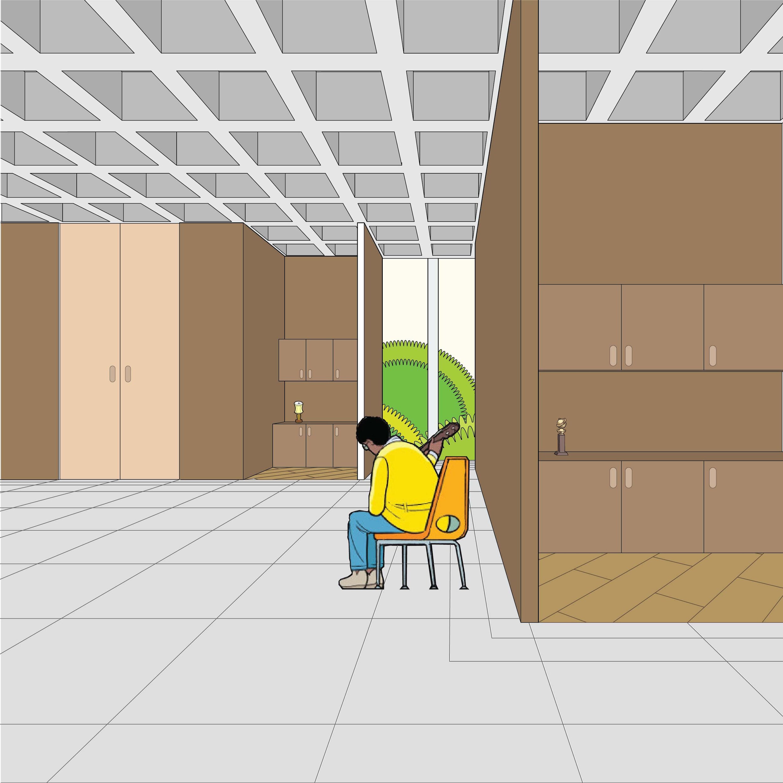
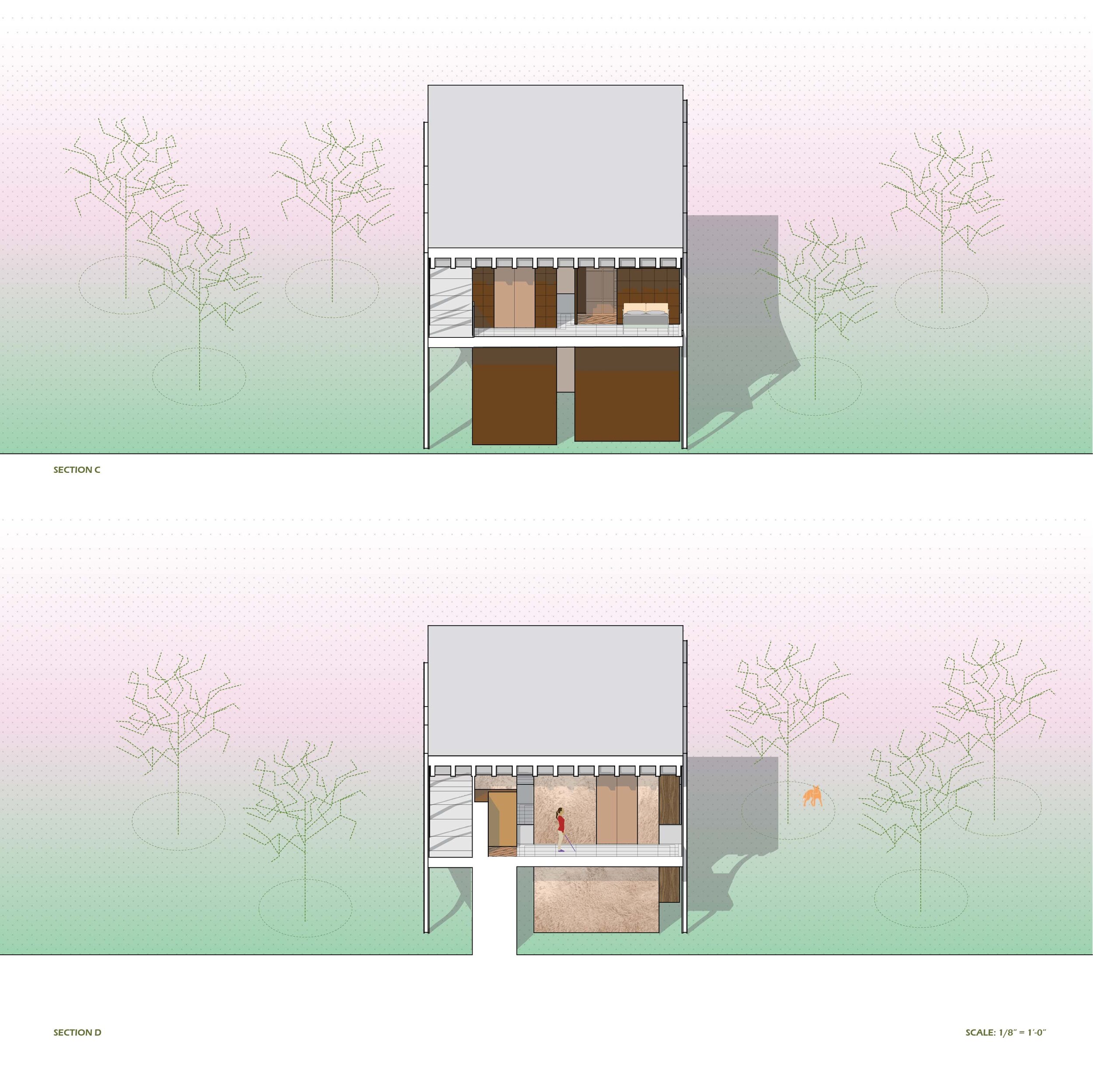
The residence has a continuous ramp that slowly elevates each room. The rooms are created not through the usage of doors but as a result of the residue space from the “cores”. The Cores are rectangular functional structures that support the building as well as holding functions that require plumbing. This helps top establish an open floor design that is still private but does not have the problems associated with strict door separation.
The continuous ramp and open floor plan makes it so that every program is easily accessible to a wheelchair user, most importantly the bathrooms. Usage of different textures such as leather, fur, and wood create distinct identities that can be appreciated by a visually impaired person. The tiles get denser towards the walls in order to alert a visually impaired individual, which also look visually appealing to anyone that is not visually impaired. Open rooms with minimal dividers provide “deaf space” which helps deaf individuals to be able to have their backs against the wall and communicate comfortably.